

US Bank
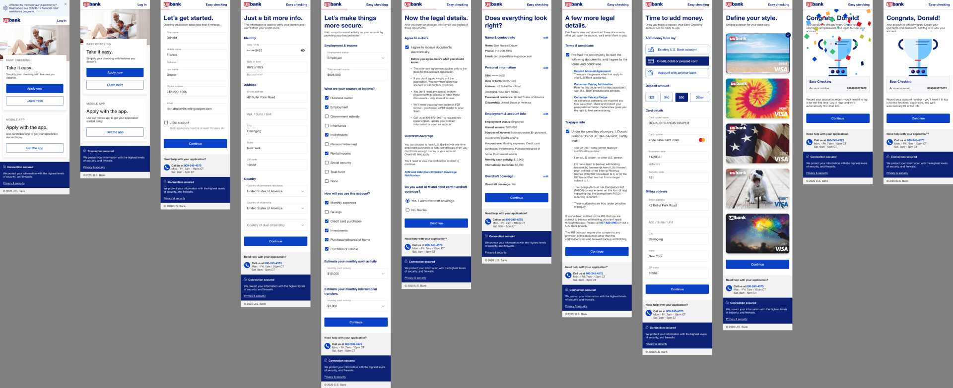
At U.S. Bank, I led the "Get and Fund" project, a complete redesign of the online account opening experience. What was once a 30-minute, regulation-heavy process that turned away most users became a streamlined, user-friendly journey. By reworking the risk and compliance engine, we enabled more good customers to open accounts quickly—without compromising security. The result: faster onboarding, higher conversion, and reduced exposure to fraud.
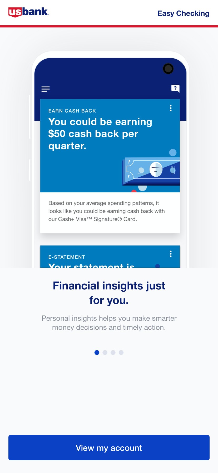
Press: New U.S. Bank mobile app delivers unprecedented personalized insights
Project Scope
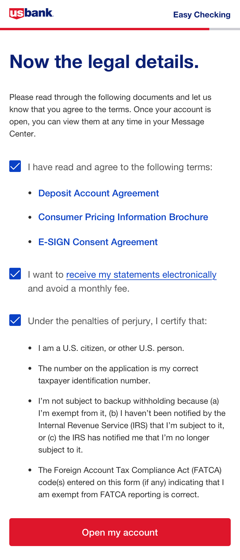
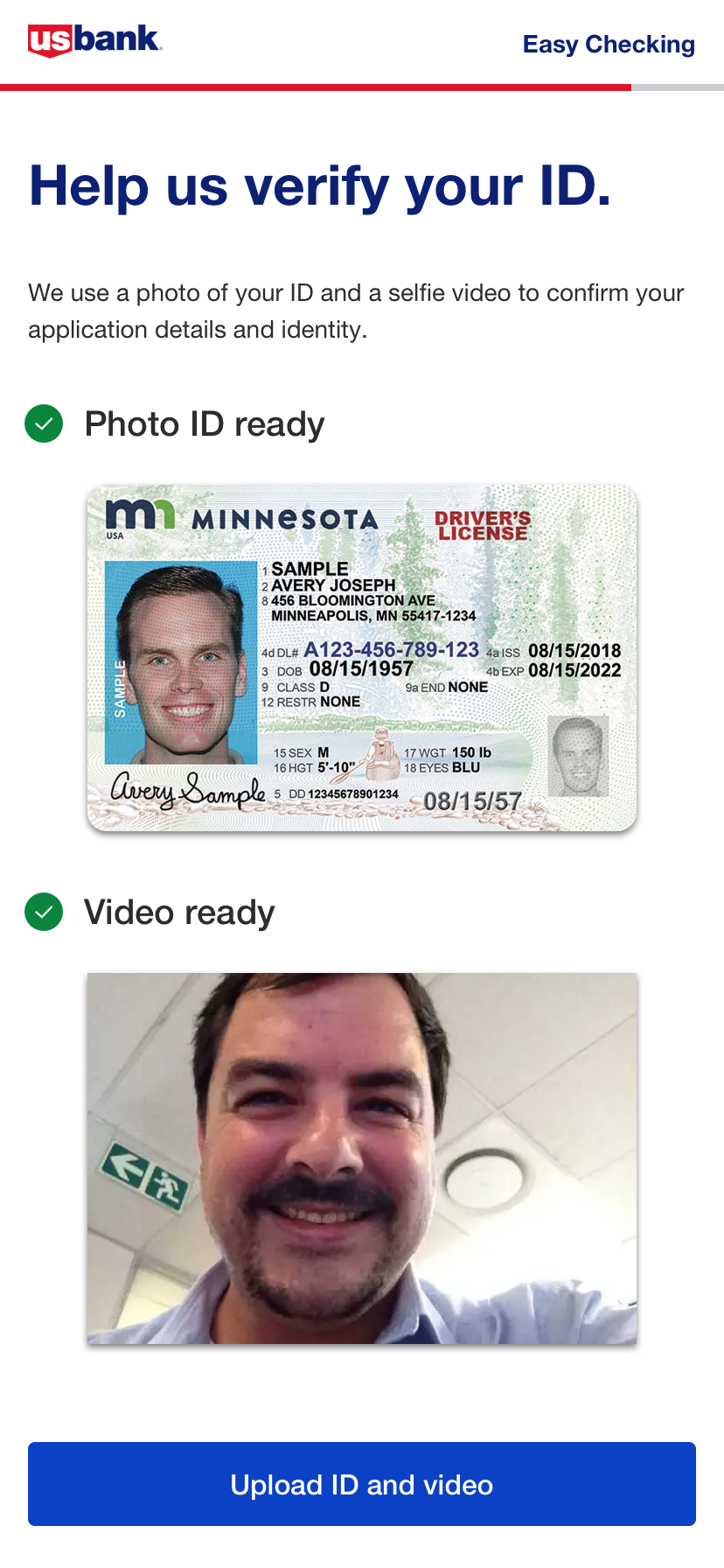
Complete redesign of the risk and compliance application process across all U.S. Bank checking products.
Key Changes
Cut screens from 34 ➝ 7
Shifted from static Angular to React + microservices
Leveraged tokenized universal design system
RESULTS
Application Completion Rate
Time to Submit
Digital Checking accounts created
Digital share of accounts
BEFORE
40%
20 mins
-
-
AFTER
70%
5 mins (-400%)
25,000+
40% (Record High)
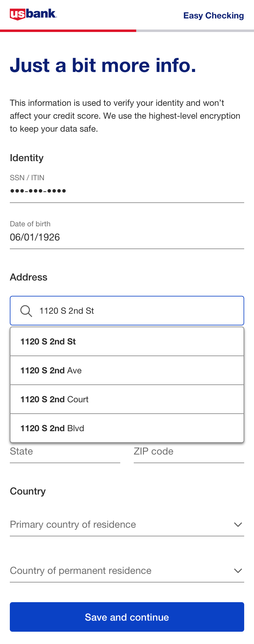
BACKGROUND
Before the redesign, many users abandoned the sign-up process because it was too long or they didn’t have the required information on hand. Others—often qualified applicants—were denied without explanation, leading to frustration and in-person visits to branches where even bankers couldn’t clarify the issue. This created friction, lost opportunities, and a poor first impression of the brand.
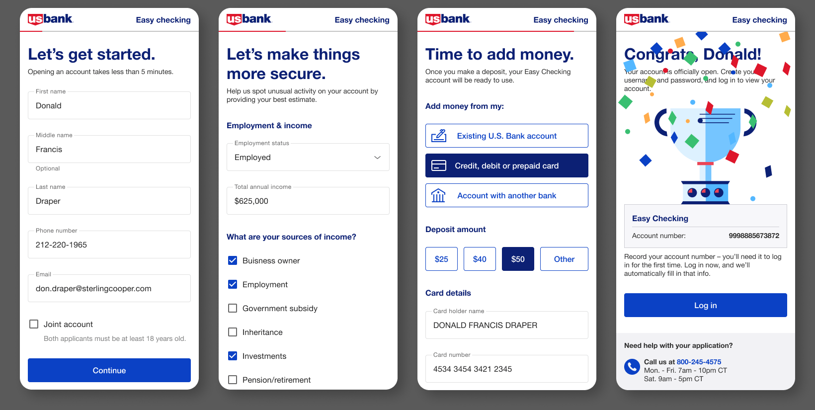
THE POWER OF FLOW: Turning KYC Into a Customer Win
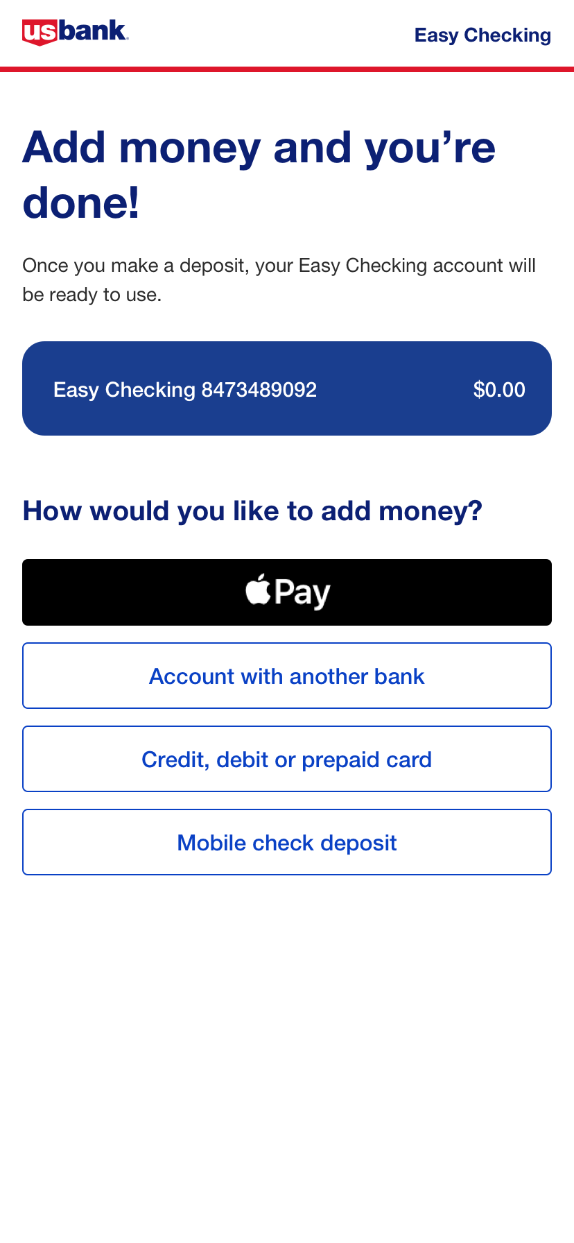
We crafted a seamless end-to-end user journey that guides customers from secure sign-in through KYC verification, effortlessly funding their new account, and selecting a personalized credit card designed to match their lifestyle. The experience culminates in an engaging, high-impact moment—a dynamic reward reveal that celebrates their sign-up and drives instant satisfaction and brand loyalty.
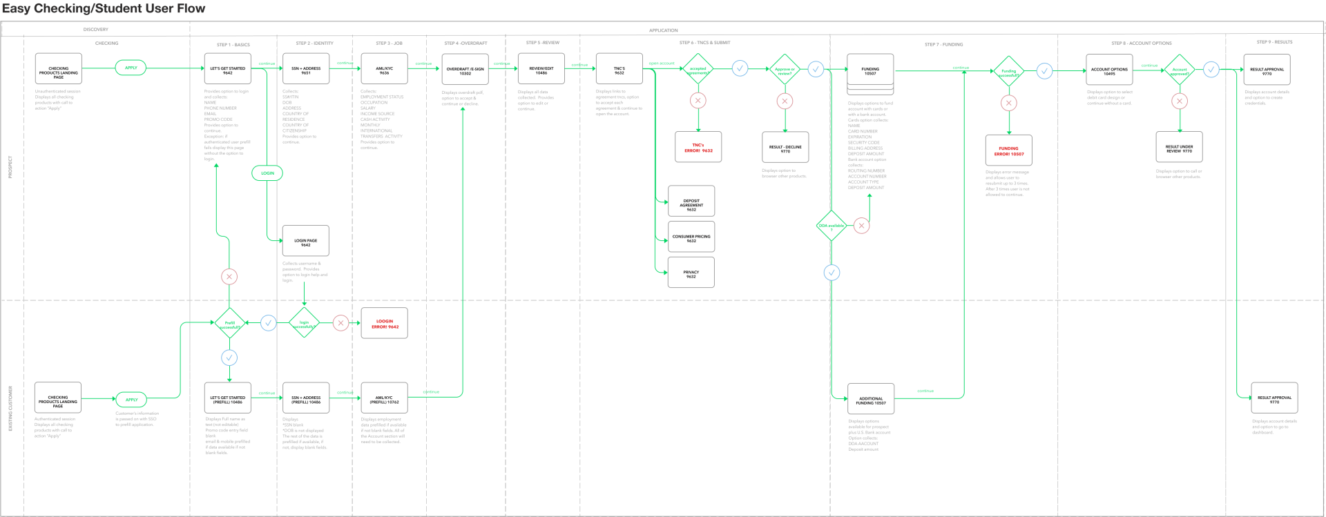
STUDENT SIGNUP
This detailed UX flow map visualizes the end-to-end experience of a student signing up for a new account. It captures every tap, decision point, and potential path—from onboarding and identity verification to product selection and funding. With multi-tap interactions, loops, and edge-case flows thoughtfully mapped, this blueprint ensures a frictionless, intuitive journey tailored to the unique needs of student users.
Credit Score Web and Native App Feature
CREDIT SCORE REDESIGN
We redesigned the credit score feature to create an interactive, user-friendly experience for new sign-ups. Users can instantly view their credit score upon onboarding and explore personalized tips to improve it over time. The experience is visual, educational, and empowering—turning what was once a static number into an actionable, confidence-building tool for financial wellness.
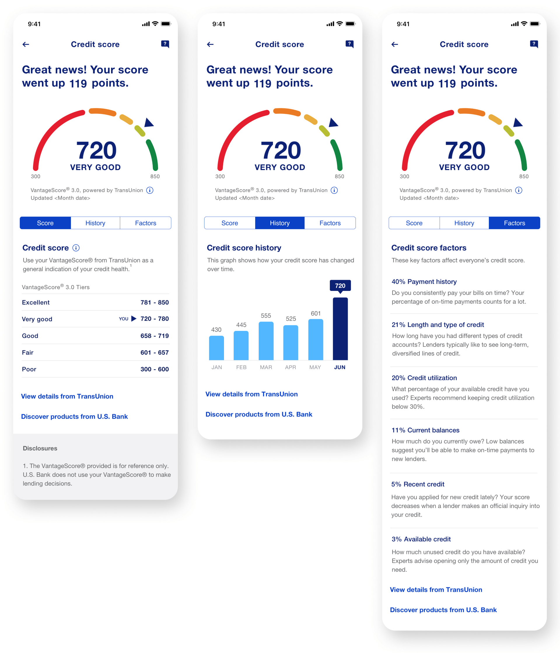
HOW IT WORKS
Sign up for free in just a few taps and get instant access to your credit score—no strings attached. You’ll receive helpful reminders, personalized insights, and simple tips to improve your score over time. Track your progress in real-time and feel confident about your financial journey, every step of the way.